Final Review and Reflection (Coffee Run)

Last Monday we began a Design Charrette. Our task was to design something that would give people who have recently moved to Brisbane the opportunity to find new areas of Brisbane that are not very well known. Our tour was required to cater to a specific audience with a specific interest or need. An example given to us was pregnant mothers finding out where to shop for their babies, and where to find other mothers of babies. My group members for this task were Pete and James (From Project 2), and also Mika and Jennifer.

I was pretty confident before starting this charrette as I had learned a lot of new things before this task. I had also been given experience with receiving a brief and trying to complete it on a very close deadline. I felt that a lot of the things I learned in my tutorials would assist a lot, such as the hands on activities, and the tutor’s advice. I attempted to include every suggestion into this  project.

We decided that our tour would show people the lesser known coffee shops in the center of Brisbane (Translink Zones 1 and 2.). At first our target audience was going to be middle aged business men and women, but after some more thought, we decided that we should instead cater to university students who have just moved to Brisbane to do their university course. After doing some research, we decided that catering to University students was the better idea because: 76% of coffee drinkers start drinking at the age of 15-24 (Which encompasses a huge portion of our demographic), coffee shops are a great place for socialising (even for people who don’t like coffee), and many university students want a cup of coffee in the morning or late at night so that they can be awake for lectures or assignment work. We decided that we would create a hop on/hop off bus tour that would start at QUT Gardens point (KG students can take the free campus shuttle to GP) and this bus would stop at 6 hand picked coffee destinations (We have a current list, but this list can change in the future with other cool places). We called our tour Coffee Run.

The 48 hour time frame was a drastic change from both the Mini Charrette which was rushed in the space of 3 hours, and Project 2, which took 2+ weeks from brief to presentation. We spent 8 hours on Tuesday as a group discussing and designing our solution. We divided up our workload in a fair way that allowed people to work in their strongest areas.

We all used advice and feedback given to us from previous projects. We included a logo, and we made the presentation follow the brand’s theme, both of which received positive feedback in Project 2. We also got James to present again, as our tutor said that he was great at it, and it also eliminated the distracting and time-wasting changing of presenters. It is great that we did all the preparation work, as I learned something new from each project and the mini charrette, and used each piece of new knowledge and advice in the Design Charrette.

Again, it was a pleasure to work with Pete, James, Mika and Jennifer, as we communicated well to each other, and we shared similar design ideas, which meant that we didn’t argue about any decisions that were made. We each had different strengths and weaknesses which made it easy to break up the work in order to cater to them.

This unit gave me a huge amount of new insight into the deign industry and reaching a deadline, no matter how close or far away. This isn’t what I expected to learn in this unit, but it is incredibly helpful nonetheless. I learned to more confident in talking about my design ideas with other people in my group, and I even feel more creative. I’m very happy with my personal progress in this unit, and it’s made me even more excited to be a part of the industry at the end of my course.

Project 2 Review and Reflection (Walk Again)

This week we presented our second project for KIB100. For project 2 we were split up into groups, with my group consisting of myself, Pete and James. Our task was to come up with an idea to solve a certain problem. The problem in question was to assist people who were physically disabled, either temporarily or permanently, in a way which would make their everyday life much easier.

One of our group members, James, suggested that we try to assist people whom have been disabled temporarily due to Lower Body Incapacitation. We agreed that it was a good idea seeing as James had been experienced in the damage, its treatment, and also how it affected his everyday life. This gave us a good foundation to base our research on.

I researched knee reconstruction and hydrotherapy in order to find out more about the disability and treatment. We decided that we would design a device that would simulate hydrotherapy by simulating weightlessness of the lower body as if it was submerged in water, allowing the user to continue doing everyday activities while rehabilitating with hydrotherapy. This idea was very unique in my opinion, although a bit too futuristic. My tutor pointed out that my sketch for our device should have had more detail in order to show the features of the device and how it worked. Our 1 minute video explained what our device did, but not how it worked, this is because we were low on time. We made a simple animation using pictures that we took of a doll, and it resulted in a funny, somewhat anecdotal way to finish our presentation.

Our powerpoint was professional, as we had a uniform layout and theme. We also had a logo which was made by Pete, which was situated in the corner of every slide, giving the powerpoint a very professional aesthetic. I had not thought of unifying the powerpoint with the theme of the brand, and I did not even consider making a logo. The positive feedback from our tutor (who is reading this right now, Hi John!) showed that using a themed powerpoint with a matching logo is a great way to make our ideas look a lot more professional. James was the speaker during the presentation and he did an excellent job. In my opinion, the presentation would not have worked as well if we had split up the speaking, as it was unnecessary.

James and Pete were great people to work with, as they were easy to communicate with and I was comfortable sharing my ideas with them. It was great to work with someone with experience in the problem we had to solve, as we got to hear his first hand experience with Lower Body Incapacitation. Our workload was spread evenly and we all contributed to the final presentation.

This, like the Mini-Charrette, was a great way to prepare for our final assessment, I learned a few more things on what to add to the final product in order to get a much better result and a much more professional presentation. In all, I feel that I am ready for the final charrette, I am happy with the many new things that I have learned, and I am happy to be working with Pete and James again.

Walk Again

Mini-Charrette Review and Reflection

Last week I took part in a Mini-Charrette for KIB100 – Design and Creative Thinking. This task involved getting briefed on what problem we were solving, being randomly divided into groups, and then designing, researching, sketching, and presenting our ideas as a group. We were required to design an interactive system that would be used in a garden located at a Queensland hospital. The idea of the garden was put forward by the indigenous community, who said that they wanted a garden with native Australian plants and information on them about things such as a plant’s name, medical use, culinary use, aroma, etc. They would also like the hospital guests to be able to access the garden, as many indigenous Australians view hospitals as a “place to die”.

I was put into a group with four girls, we decided to go down to the Botanical Gardens and create our plan for the project. This was a good decision, as we gained a lot of inspiration from the gardens. We were seated near an archway, so we decided to incorporate archways into our final design. These archways would play audio which would explain a plant in the garden when someone walked through them. We also decided to add a sensor to the arch so that it would only play the audio if it sensed a chip. We did this because we wanted to give people the ability to opt out of hearing the audio if they just want to go to the garden to relax instead of to learn. I think that the use of audio was a great idea because blind people and people that are in hospital beds or wheelchairs will not be able to easily read information from signage, and will find it much easier to simply relax and listen. At first, I thought this idea was overly simple and not particularly creative, but after presenting and hearing feedback, I realized that we had in fact thought of a good solution which did exactly what was asked of it. We were encouraged to take risks in our design, and personally, I believe that we could have taken bigger risks as this was a perfect opportunity to do so.

The people that I worked with were easy to communicate and plan with. We all split our workload in a fair way and we all contributed a good amount of ideas. We organized our allocated time very wisely into planning, researching and designing, but we rushed the video that we used to present ideas. We also did not find the time to create a powerpoint to assist us in presenting our concept. I believe that a powerpoint would have shown our ideas in a much more professional and engaging way.

Before presenting ideas, three of my group members had to leave because the Seminar went overtime. This left me and one other group member to present ideas. I believe that both of us presented professionally, although we could have planned the presentation a bit more, and could have used more professional language.

I believe that this was an important task to undergo before our official Charrette. I got to experience working with people I had never met before, in a situation where our time was very limited. I have learned how to better manage my time and will hopefully find time to prepare a more professional presentation when I am undergoing the official Charrette.

Annotated Bibliography for Project 2 (Walk Again)

Here’s my annotated bibliography:

In project 2 we are focusing on designing something that will assist disabled people with their daily lives in order to become more independent.  Because someone in my group has had experience with temporary Lower Body Incapacitation, we decided to focus on this particular disability, and come up with a way to assist people with broken legs or other lower body injuries.

“Orthosports” (2009). ACL Reconstruction. Retrieved April 10, 2013, from http://www.orthosports.com.au/content_common/pg-acl-reconstruction.seo
This web page explains the process behind reconstructing a torn anterior cruciate ligament, which is just one of the many parts of the leg that can be damaged, showing what happens during the operation, and also rehabilitation following the operation. This gives us an idea of already existing methods that are used to heal this ligament. There is also a video which demonstrates some of the process. This will help our design as we will now understand how the damage is healed and other treatments, giving us something to emulate or assist with our device.

“Sydney Orthopedic Specialists” (2013). Knees. Retrieved April 10, 2013, from http://www.sydneyorthopaedic.com.au/knees.html
This web page lists multiple different knee injuries and how they can each be healed, as well as possible risks, all available treatments, etc. They also have a large amount of videos that all show the processes that can be undertaken to fix many different injuries. This just expands on the previous reference, giving us even more of an idea of knee damage and fixes which will help with designing our solution.

Shiel, W. C. (n.d.). Broken Leg. Retrieved April 10, 2013, from http://www.emedicinehealth.com/broken_leg/article_em.htm
This is an article with multiple pages, providing a huge amount of information on broken legs, their treatment, prevention, self-care, etc. This article also strengthens our understanding of these injuries and how they can be treated. It also has a “self-care at home” page which shows us what people with broken legs need to be aware of at home, and perhaps our device could assist them with this.

Kennett, P. (2013). Tips for Home Survival. Retrieved April 10, 2013, from http://www.mybrokenleg.com/tips.html
This site gives tips to those with broken legs on how they can deal with their broken legs in their home. It talks about food, sanitation, clothing, communication, and more. Our device could possibly use some of these tips in order to make the device more worthwhile and beneficial for the patient, assisting them in more ways than one.

Hydroacive Ltd. (2010). What is Hydrotherapy. Retrieved April 10, 2013, from http://www.hydroactive.net/what-is-hydrotherapy.htm
This website explains what Hydrotherapy is, how it works, and what benefits it provides. We have decided that our device will emulate hydrotherapy in some way so that people can be treated in the same way, but at any time of day, while doing any activity, such as walking to the shops, cooking food, etc.

Rehabcorp Physiotherapy. (n.d.) Benefits of Hydrotherapy. Retrieved April 10, 2013, from http://www.rehabcorp.com.au/hydrotherapy/benefits-of-hydrotherapy.html
Like the last link, this site goes in depth into what benefits hydrotherapy provides and why people should consider treatment with it.

Project 1 Review and Reflection

Hi again!
Last week, we were looking at a brief given to us by our tutor. This brief outlined the fact that not many young people save for the future, and even less save for retirement. We were tasked with coming up with potential solutions for this issue that will encourage young people to save money (and learn about it too!). Me, along with my group members, James and Pete, came up with a few solutions. Firstly, we proposed an idea in which people could save with a social network, and compare savings or compete for prizes. Another idea was to make an advertising campaign which depicted a person’s life being better if they save money for the future, because “a dollar tomorrow is worth more than a dollar today!

Anyway, before coming up with prototypes with any potential, we first had to research our demographic. Our demographic for this task was, of course, young people in their late teens to mid-late twenties, and we all know where people that age congregate! Facebook! So my group members and I wrote a survey and distributed it via Facebook. Our feedback was mostly unsurprising, although we were quite confused when we found that not a single person wanted to share their financial information via social networking. We quickly figured out that this was due to people not wanting to brag about money or not wanting to see that someone else has more money than them. People, of course, wanted to win prizes for saving, which is a complete no-brainer, people will do anything if it means they could win something, right?

We also asked people about their main form of entertainment. Most people answered that they watched TV, surfed the internet, watched movies, and watched Youtube videos. This of course shows us the best places to advertise our new product, this could eventually be even more specific, by researching the content of each media outlet that people in our demographic will watch the most, and then targeting our advertising at the right time (Meaning that we probably won’t do a good job at advertising to young adults during Antiques Roadshow).

To finish off our investigation, we asked people how much money they thought they would need to support their lifestyle after retiring. The numbers varied a huge amount, from $100, 000 all the way to $5, 000 000, which is a huge difference, so of course we would need to include accurate figures in our advertising, in order to teach people how much money they need, because it’s a pretty important detail.

I think our method of surveying was done well when we only had a few days to get answers, and only our combined friends lists on Facebook to answer our questions, but it is not a 100% accurate depiction of our demographic’s opinions, because we need to think about who would have taken the survey. What we definitely know is that people who took the survey are a very small sample of people in this demographic, all are Facebook users, and all are friends with one of me or my group members. We also know that many people would have seen “Survey” and thought “Nope. Not doing a survey,” effectively giving us a small sample of people who were either really bored or just wanted to help us out. In my opinion, the best way to survey a huge group of people for this would be to distribute it over many different media outlets, and perhaps throw in an incentive to encourage more people into actually partaking.

I think as a first exercise, this worked well, we learned more about our demographic, and we crossed off a possible idea due to the survey, which changed our direction to one which would have eventually lead to a much better solution in the end. We now know that people do not want to compare savings, as sharing that information can make people feel spoilt, guilty, or even embarrassed, which is not a good way to encourage sharing saving progress socially.

Designers That Inspire Me

I never really looked at a logo that I thought was well-designed and thought, “Wow, I wonder who designed that?” I am more inspired by art itself, I don;t go out of my way to find out more about a designer, because that doesn’t interest me, instead of looking for the designer of a logo that I like, I instead look for what style and elements that design utilises, such as minimalism and the use of negative space. I am also a sucker for vibrant colours, and as far as I know, the trend right now is minimalist, designs that incorporate vibrant, flat colours. Take Windows 8 for example, the whole operating system is full of minimalism and flat colours, from the app tiles, to the shut down screen. In my opinion, this style is my favourite, I just love how simple everything looks, yet I can understand and respect the huge amount of effort that it actually required for the designers to make everything look so simple, yet still portray the right message and look attractive.

Now, when looking for some specific logos that inspired me, I actually came across a design firm named LogomotiveI looked through their portfolio, and I have not yet seen a logo in their gallery that I do not like, Every single logo that they have on display incorporates exactly what I said earlier, I have chosen my favourite logos from their site and put them below. Each of them is designed intelligently and does an excellent job of signifying their brands.

Image

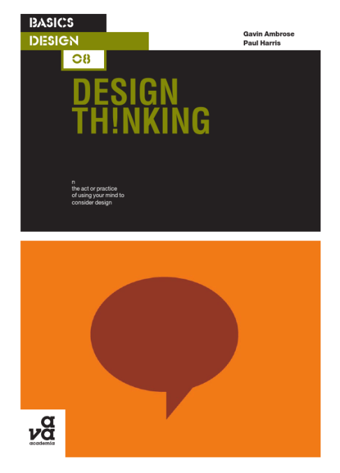
Book Review – Design Thinking

Design Thinking is a book written by Gavin Ambrose and Paul Harris. It is focused around the seven Stages of Thinking when creating a commercial design. This book clearly outlines the stages a designer should go through in order to turn a client’s design brief into a product that the client will want to pay for. This book argues that design is a completely creative process, but the process is controlled by, and requires following the Stages of Thinking.

                The book itself is split up into these “stages of thinking” as defined by Ambrose and Harris. The seven stages that the book addresses are: define, research, ideate, prototype, select, implement and learn. It begins by giving a general analysis of all 7 stages. Design Thinking is a great resource for anyone looking at following this design technique, as each of the seven stages has a checklist, and the book recommends that all items are checked before moving on. Failure to do so could lead to a disaster later on Ambrose and Harris tell us.  After outlining the seven stages, it shows an example of the design process being used when producing a logo for a company named Sovereign. Then it proceeds to discuss broader stages, in which it goes into depth about research, idea generation, refinement, prototyping, and implementation, giving a chapter to each.

                Design Thinking is a great resource for aspiring designers who want to learn more about the seven stages of design. At some points, the book feels like it is saying that this process should be followed 100% of the time, which at times, impedes somewhat on the notion that creative ideas can sometimes just be spontaneous. While the idea of these 7 stages is a great concept, it is not the “be all or end all” of a design, as amazing designs can (and have) been conceived without following these steps.

Image

Hello World!

My name is Liam, I’m 17 years old and I am doing a Bachelor in Fine Arts (Interactive and Visual Design) AND a Bacheor in Information Technology at Queensland University of Technology.

I want to be a graphic designer when I graduate, mainly in the strands of design for web and design for print. The idea of people seeing my work and thinking “wow, that looks great” really excites me, and some day I hope to work for a huge international company and have my work seen all over the globe. I still have a long way to go in my own development as a designer, and I have many things that I hope to learn from this unit (Design and Creative Thinking) this year.

– How to portray the right message with my work.
– How to successfully design something from planning to finishing the final product, and then learning from that product.
– How to use illustrator (It confuses me, even after 7 years experience with Photoshop!)